 Frontfire Demo
Images
Block images
Block images always take the entire row. They are always centered and need the center class.
Block images are always restricted to the available width and are scaled down if necessary. To maintain the original aspect ratio, you must not explicitly set the height of the image.
Additional effects are available with the shadow class for a slight drop shadow and the white-margin class for a white margin around the image. Both classes can be combined (and in fact should if you want to see the white margin unless your page background isn’t white).
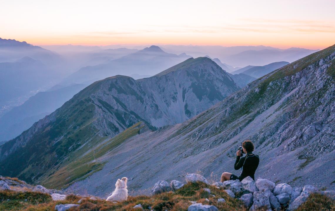

Images can be expanded to always fill the entire row with the full-width class. Be aware that these images may become very tall on wide windows. So images with a wide aspect ratio are most suitable for this. You might also restrict the content width like on this page.
To make images even bigger, they can be placed outside of a .page-width element to fill the entire window width. The page-width container must be closed before and reopened after the image element. Since there must only be a single <main> element on a page, if you want to break it up to allow full-width content, you have to introduce another level between <main> and the content that applies the .page-width class for restricted width. A simple <div class="page-width"> will do. Look at the source code of this page to see how it’s done.
Floating images
Floating images are aligned at the left or right side with the left or right class. Following content flows around the image at the other side.
Floating images are always restricted to half the available width and are scaled down if necessary. To maintain the original aspect ratio, you must not explicitly set the height of the image.
If an image should stop floating below a minimum width, one of the classes require-minitab, require-tablet, require-desktop and require-wide can be added.
The image will then turn to a block image if the viewport gets narrower than the specified type.
The image remains aligned at the side where it would have floated. This can be overridden with the classes narrow-left, narrow-right and narrow-center.

Lorem ipsum dolor sit amet, consectetur adipiscing elit. Morbi in augue bibendum, efficitur nunc vel, placerat massa. Duis enim dui, ultrices eu felis cursus, lacinia fermentum erat. Mauris id ipsum mi. Duis nec vulputate sem, vel egestas justo. Maecenas suscipit tristique lectus. Class aptent taciti sociosqu ad litora torquent per conubia nostra, per inceptos himenaeos. Ut sollicitudin ex laoreet mi tempus, id mollis dolor scelerisque. Mauris iaculis tristique ligula, eget efficitur sapien iaculis sed. Sed commodo lacus vel neque pulvinar ultrices. Nulla finibus ut augue et pellentesque. Nulla sed tempus diam, in semper odio. Sed malesuada volutpat neque vitae dignissim. Praesent sit amet sem porttitor, convallis ex varius, vulputate diam. Vivamus a enim ac velit mattis cursus. Maecenas vestibulum tincidunt eros in vulputate.
Fusce varius urna eget justo egestas, non convallis dolor condimentum.

Images can be clipped to a circular shape with the circle class, like here on the right side. Text still flows around the bounding rectangle of the image though. Text flowing along the actual shape requires a lot more markup which is not shown here for now.
Donec eros neque, pharetra eget nisl finibus, sagittis mattis ligula. Sed a urna porttitor, egestas dui finibus, semper augue. Nulla vel eros massa. Quisque lacinia, orci ac viverra faucibus, libero urna posuere magna, eget sagittis lectus mi id felis. Etiam at magna sit amet urna euismod tincidunt sed nec lorem. Cras vitae lorem turpis. Quisque rhoncus, justo at mattis sagittis, nibh nisl tempor lectus, id commodo est sapien quis ante.
Quisque porta nibh justo, iaculis rhoncus mi malesuada nec. Sed commodo lacus vel neque pulvinar ultrices. Nulla finibus ut augue et pellentesque. Nulla sed tempus diam, in semper odio. Sed malesuada volutpat neque vitae dignissim. Praesent sit amet sem porttitor, convallis ex varius, vulputate diam. Vivamus a enim ac velit mattis cursus. Maecenas vestibulum tincidunt eros in vulputate. Pellentesque egestas massa mauris, ac vestibulum orci pulvinar ut. Donec porttitor congue odio, auctor efficitur magna lobortis ut. Sed efficitur sollicitudin leo in lacinia.
Subtitles
To combine an image with a subtitle text below it, use a <div> element that contains the image and then the subtitle content.
For floating images, the <div> element has the image-left or image-right class.
For block images, the <div> element has the image-center or image-full-width class.
<div class="image-right">
<img src="image.jpg">
This text describes the image above.
</div>
The same require- and narrow- classes as described above can be used here to configure behaviour for smaller screens.
This text describes the image above.
Lorem ipsum dolor sit amet, consectetur adipiscing elit. Morbi in augue bibendum, efficitur nunc vel, placerat massa. Duis enim dui, ultrices eu felis cursus, lacinia fermentum erat. Mauris id ipsum mi. Duis nec vulputate sem, vel egestas justo. Maecenas suscipit tristique lectus. Class aptent taciti sociosqu ad litora torquent per conubia nostra, per inceptos himenaeos. Ut sollicitudin ex laoreet mi tempus, id mollis dolor scelerisque. Mauris iaculis tristique ligula, eget efficitur sapien iaculis sed. Pellentesque habitant morbi tristique senectus et netus et malesuada fames ac turpis egestas.
Here is a longer text that describes what you can see in the centered image directly above it.
Fusce varius urna eget justo egestas, non convallis dolor condimentum. Donec eget augue ut ligula porttitor consequat. Donec eu magna sit amet risus auctor pharetra at at mi. Integer eget mattis ex, nec pharetra eros. Proin nec sem tempus, efficitur dui sit amet, aliquam urna. Phasellus tincidunt pellentesque molestie. In hendrerit scelerisque venenatis. Mauris commodo consequat nulla id hendrerit. Suspendisse a porta sapien. Sed id tortor eu nulla semper dictum. Curabitur at neque eleifend, dignissim odio ut, viverra turpis.
Here is a longer text that describes what you can see in the centered image directly above it. And some more words to fill up the line for sure.
Donec eros neque, pharetra eget nisl finibus, sagittis mattis ligula. Sed a urna porttitor, egestas dui finibus, semper augue. Nulla vel eros massa. Quisque lacinia, orci ac viverra faucibus, libero urna posuere magna, eget sagittis lectus mi id felis. Etiam at magna sit amet urna euismod tincidunt sed nec lorem. Cras vitae lorem turpis. Quisque rhoncus, justo at mattis sagittis, nibh nisl tempor lectus, id commodo est sapien quis ante.
Links
Images can be placed in a hyperlink as well. The image then becomes part of the link and can be clicked.
Fusce varius urna eget justo egestas, non convallis dolor condimentum.
This text describes the image above.
Donec eget augue ut ligula porttitor consequat. Donec eu magna sit amet risus auctor pharetra at at mi. Integer eget mattis ex, nec pharetra eros. Proin nec sem tempus, efficitur dui sit amet, aliquam urna. Phasellus tincidunt pellentesque molestie. In hendrerit scelerisque venenatis. Mauris commodo consequat nulla id hendrerit. Suspendisse a porta sapien. Sed id tortor eu nulla semper dictum. Curabitur at neque eleifend, dignissim odio ut, viverra turpis.
Quisque porta nibh justo, iaculis rhoncus mi malesuada nec. Sed commodo lacus vel neque pulvinar ultrices. Nulla finibus ut augue et pellentesque. Nulla sed tempus diam, in semper odio. Sed malesuada volutpat neque vitae dignissim. Praesent sit amet sem porttitor, convallis ex varius, vulputate diam. Vivamus a enim ac velit mattis cursus. Maecenas vestibulum tincidunt eros in vulputate. Pellentesque egestas massa mauris, ac vestibulum orci pulvinar ut. Donec porttitor congue odio, auctor efficitur magna lobortis ut. Sed efficitur sollicitudin leo in lacinia.